
Mobile · iOS & Android
Solar energy · Sweden
Energy markets · FCR
B2C + B2B
Solar Monitoring & EV App + VPP Management System
Two products built simultaneously for a Swedish solar energy company entering the consumer digital market and Sweden's ancillary energy services market, a B2C mobile app for solar monitoring, EV charging, and energy savings, and a B2B desktop tool for Virtual Power Plant management and FCR participation.
Product 1: Mobile App
B2C · iOS & Android · Customer-facing
Solar monitoring, EV charging management, battery optimisation, energy market participation, and savings tracking for Sesol's customers in Sweden and Norway.
Product 2: VPP System
B2B · Desktop · Admin tool
Management interface for Virtual Power Plant operations, translating Svenska kraftnät's FCR regulatory framework into an operational tool for energy market administrators.
COMPANY
Sesol AB
MY ROLE
Sole Product Designer
DURATION
2+ years
PLATFORM
iOS · Android
* Unfortunately, since the project is confidential because of my employer's NDA contract, it isn't possible to share more details about the design deliverables. If you have any questions about the process or any particular aspect of the project, let me know.
Executive summary
THE PROBLEM
Solar energy customers had no dedicated tool to monitor consumption, manage EV charging, or understand their savings
Sesol's customers relied on generic third-party apps that offered no integration with their specific installation, no savings transparency, and no EV or battery management, limiting engagement and creating a competitive gap.
MY ROLE
Sole designer, led end-to-end product definition, UX, and design system over 2+ years
Owned the full design process across two products: The app (B2C mobile app for solar monitoring and EV charging) and a VPP management system (B2B desktop tool for energy market participation). Collaborated with marketing, development, QA, and the Product Owner throughout.
CORE DESCISION
Design for two distinct user types from the start, new customers and existing installation owners
Pilot testing revealed that a single onboarding path created significant friction. Splitting the flow into two explicit paths, account creation for new customers and account linking for existing installations, was the single change that most directly reduced onboarding issues.
+30%
Sales creation time, measured via user interviews and Hotjar post-launch
-35%
Onboarding issues, measured during pilot testing after the two-path flow was introduced
25%
Faster UI delivery, enabled by the cross-platform design system (iOS & Android)
Strategic context
Sesol had no customer-facing digital product. Solar panel owners had no way to monitor their system, track savings, or manage EV charging beyond generic third-party tools.
Building the app was a strategic initiative to increase customer engagement, introduce subscription-based models, and create a competitive advantage through better cost and savings transparency. In parallel, a VPP management system was initiated to enable Sesol to participate in Sweden's ancillary energy services market, a technically complex and regulatory-driven problem that required translating Svenska kraftnät's FCR rules into an operational interface for administrators.
DEFENDING CONSTRAITS
-
NDA limits shareable deliverables, Figma files available on request
-
Sole designer across two distinct products simultaneously
-
New market, Swedish and Norwegian users, unfamiliar demographic
-
Pre-launch phase, direct user research limited by confidentiality
-
Development paused two weeks before launch due to business reprioritisation
WHY IT MATTERED
-
No dedicated app meant customers had no reason to stay engaged post-installation
-
Competitors offered basic monitoring, Sesol needed a differentiated experience
-
Subscription model required a product customers would return to regularly
-
VPP participation would open a new revenue stream through energy market services
1
Mobile app
B2C · iOS & Android
Customer-facing mobile app for solar monitoring, EV charging management, energy market participation, and savings tracking.
Mobile
B2C
Design System
Mix panel
1
VPP system
B2B · Desktop
Admin tool for managing Virtual Power Plant participation in Sweden's FCR energy market, translating Svenska kraftnät's regulatory framework into an operational interface.
Desktop
B2B
FCR
Wireframes
Key design desicions
OPTION CONSIDERED
1
Onboarding flow
A single onboarding path was used for all users regardless of whether they were new customers or already had a Sesol installation. Pilot testing revealed significant friction, existing customers didn't understand why they needed to "create an account" for a system they already had.
2
Battery & energy market UX
Battery configuration and energy market participation (FCR, peak shaving) were presented using technical terminology and parameter-based controls. Users had no visibility into what actions meant in terms of real savings or grid impact, making the feature feel complex and unrewarding.
3
Cross-platform design system
Initial designs were being produced screen by screen without a shared system, creating inconsistencies between iOS and Android and slowing down the development handoff. The external agency's style guide needed adaptation to function as a scalable product design system.
DESICION MADE
Split the onboarding into two explicit paths: account creation for new customers, and account linking for users with an existing installation. Each path was designed to match the user's actual context, reducing confusion at the most critical drop-off point.
Redesigned the battery overview and energy market flows to lead with outcomes, savings amounts, charge levels, and participation status, rather than technical parameters. Configuration options were preserved but moved behind a secondary layer, accessible only when needed.
Built a cross-platform design system adapting the agency's style guide to native iOS and Android components, balancing brand consistency with platform conventions. The system was maintained and expanded throughout the project as new features were added.
OUTCOME
-35% Onboarding issues measured during pilot testing. The two-path structure resolved the primary source of confusion identified in early sessions.
Supported by partial pilot testing records and stakeholder feedback. Formal Mixpanel tracking was planned for post-launch.
+30% Engagement increase attributed in part to making the app's most complex features accessible to non-technical users, removing the barrier between having a solar installation and actively benefiting from it.
+25% Faster UI delivery. The shared system reduced design-to-dev friction, enabled consistent implementation across platforms, and gave the team a stable foundation for future iterations.
Product 1: Mobile app
Designing the solar energy experience customers never had.
A B2C mobile app for iOS and Android giving Sesol's customers one place to monitor their solar system, manage EV charging, track savings, and participate in energy markets, built from scratch as Sesol's first consumer-facing digital product.
Research & competitive analysis
Discovery · SWOT · User profiles
SWOT
User Research
Competitive Analysis
Because direct customer research was constrained by the project's confidentiality requirements, discovery relied on a combination of competitive analysis, internal stakeholder insights, and market research. A SWOT analysis mapped Sesol's position relative to competitors in the Swedish solar market, identifying the gaps a custom app could address. User profiles were defined based on installation data and sales team knowledge, covering new solar customers, existing installation owners, and EV drivers managing home charging.
Direct user interviews were limited during this phase due to NDA constraints. Research strategy was designed to maximise internal signals and validate assumptions through pilot testing.
Identifying main competitors - SWOT

Extract from an analisys made for one of the main competitors. The analysis allowed us to determine which features could be more important for the users, resulting in a better planning (roadmap, delivery dates, prioritisation, MVP definition).
User personas


User personas were defined based on internal research sources, installation data, sales team knowledge, and stakeholder insights, given that direct access to end users was limited during this phase. Rather than treating this as a constraint, the personas were built to be as specific as possible within those boundaries: each profile captured not only demographic and behavioural patterns but also the devices users were likely to own and the colour associations they brought to energy and sustainability contexts. This informed both the design system's visual direction, colour palette and iconography, and feature prioritisation throughout the design phase. The personas functioned as a shared northstar for the team, grounding design decisions in a consistent picture of who the app was being built for, even in the absence of direct user research.
Design system
Cross-platform · iOS & Android · Satoshi
iOS
Android
Figma
A cross-platform design system was built by adapting the brand's style guide, developed by an external agency, into a scalable product system for iOS and Android. The system balanced native platform conventions with custom components, using Satoshi as the primary typeface. It was maintained and expanded throughout the project as new features were added, giving the development team a consistent foundation and reducing design-to-dev friction across both platforms.
Full design system files are confidential. Non-sensitive component examples available in Figma on request.
Style guide (provided by external agency)


On the left: Color palette provided by the NY Agency. On the right: Color palette defined and implemented in the design system library.
App logo (provided by external agency

On the left: Logo definition by the NY Agency. On the right: Internal explorations with different variants of the app logo
Typography definition (provided by external agency)


On the left: Satoshi typography defined by external agency. On the right: Typography defined and implemented in the design system library.
React Native Elements

The design system for the app was built on top of React Native Elements, a decision made collaboratively with the development team based on their existing stack and technical familiarity with the library. React Native Elements provided the structural foundation while allowing full customisation of the visual layer, typography, colour palette, and iconography were defined specifically for the app rather than inherited from the library defaults. Interactions were evaluated case by case: native platform behaviours were preserved where they reduced friction and met user expectations on iOS and Android, while custom interactions were introduced where the design proposals required a more specific or differentiated experience. This approach balanced implementation efficiency with the flexibility needed to maintain a consistent, on-brand product across both platforms.
Custom design system components


Custom iconography


Wireframes & iteration
Early concepts · Stakeholder testing · Pilot feedback
Wireframes were used to validate structure and flows with the product owner and development team before moving to high-fidelity designs. Stakeholder testing sessions refined feature priorities and interaction patterns, particularly for the onboarding flow and the energy market participation screens, both of which required multiple iterations before reaching a solution that balanced simplicity with the underlying technical complexity.
Direct user interviews were limited during this phase due to NDA constraints. Research strategy was designed to maximise internal signals and validate assumptions through pilot testing.
Main section screen concepts


A selection of early wireframes and first concepts across the app main sections. These artefacts were produced before any high-fidelity work began and shared with the product owner and development team to validate structure, navigation, and feature logic early in the process. At this stage, decisions about information hierarchy, screen flow, and interaction patterns were tested and refined through stakeholder feedback sessions, allowing feasibility issues to be surfaced before they became costly to resolve. The wireframes went through multiple iterations, particularly for the onboarding flow and the energy management screens, where the balance between technical complexity and usability required the most deliberate design thinking.
Color explorations


The colour palette was derived from a style sheet provided by an external branding agency. Working with the wireframes alongside the agency's style sheet made it possible to evaluate how the brand colours translated into product contexts, screens with dense data, dark backgrounds, and accessibility requirements, before committing to the final design system palette. This process ensured the visual direction was grounded in real usage scenarios rather than applied directly from a brand document.
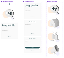
Onboarding & home
Splash · Account creation · Account linking · Home screen
The onboarding flow was redesigned after pilot testing revealed that a single path created significant friction for existing Sesol customers. The solution split the experience into two explicit paths, account creation for new customers, and account linking for users with an existing solar installation, each designed to match the user's actual context. The home screen was defined as the operational starting point: a summary view giving users immediate visibility into their energy status and the actions most relevant to their day.
Home screen - Users

First time opening flow
Home screen - Admin

A dedicated flow was created for a third user type: installers. Unlike end customers, installers required access to account creation and administration tools, allowing them to set up new customer accounts, link installations, and configure the initial system parameters directly within the app. Separating this flow from the standard onboarding ensured that installer-specific actions were not exposed to regular users, keeping the consumer experience clean while giving installers the access they needed to do their job on site.
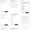
Battery & energy market
Battery overview · Configuration · FCR participation
Battery management and energy market participation were among the most technically complex features in the app. The design challenge was to make configuration and market participation accessible to non-technical users without oversimplifying the underlying mechanics. The solution led with outcomes, current charge level, estimated savings, and participation status, keeping technical configuration accessible but secondary. This approach reduced the cognitive barrier between owning a solar installation and actively benefiting from it.
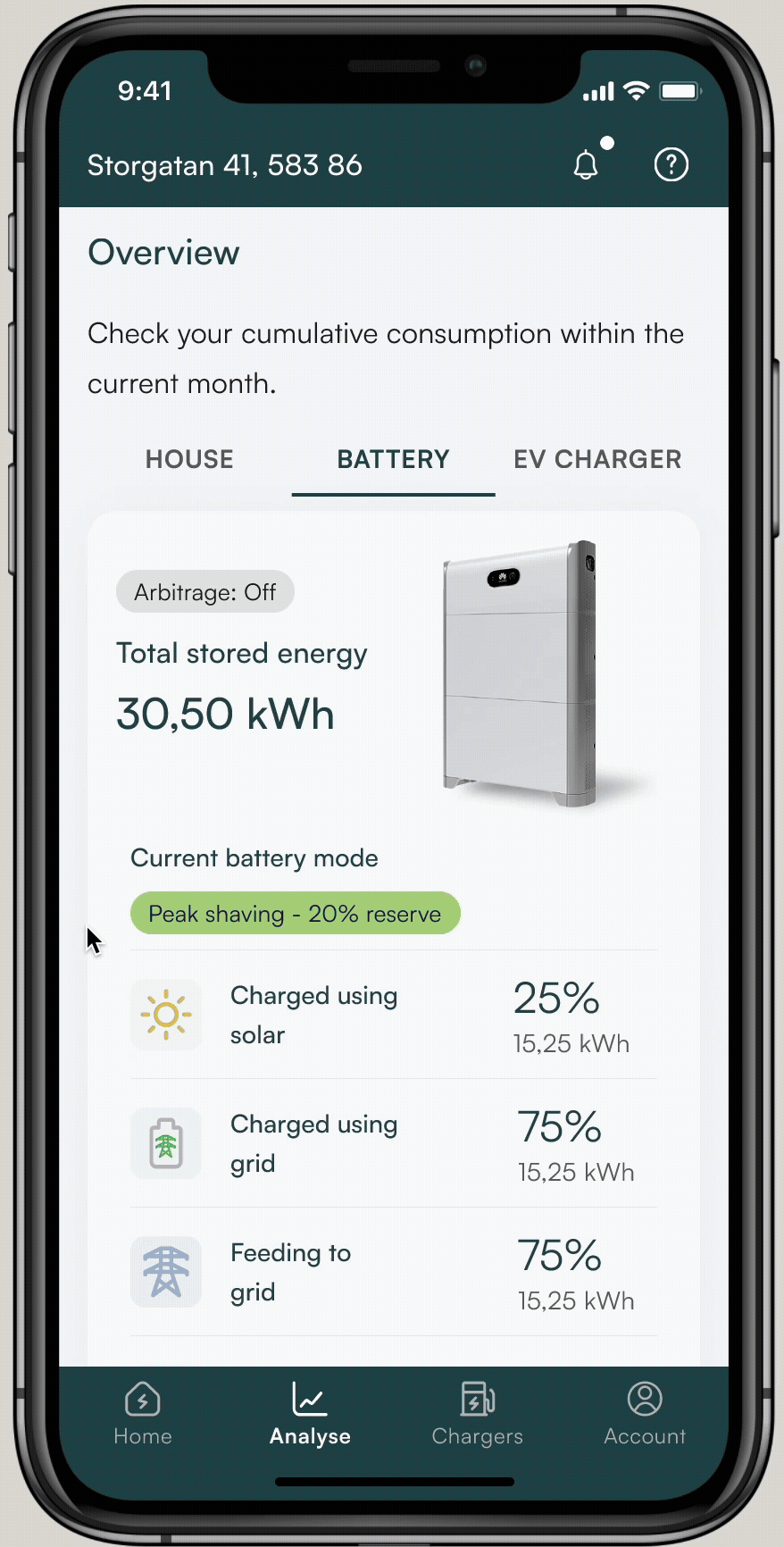
Users were able to participate in grid balancing, contributing their battery capacity to help stabilise the energy network, subject to the applicable regulatory rules governing FCR participation in Sweden. Because grid balancing actions carry real financial and grid-stability implications, participation required confirmation through a digital signing method, ensuring that users actively authorised each action rather than triggering it accidentally.
My savings
Solar savings · Cost transparency · Historical view
The savings section was designed to answer the question solar customers ask most, "is this actually worth it?" By surfacing cumulative savings, cost comparisons, and solar contribution data in a clear, visual format, the feature gave users concrete evidence of the value of their installation. Transparency in savings data was identified early as a key competitive differentiator for Sesol, and the design prioritised clarity over detail to make the information immediately meaningful regardless of the user's technical background.
Users could visualise their current savings alongside a projection of potential gains based on whether they participated in the balancing program or not. Presenting both scenarios side by side was an intentional design decision, making the financial benefit of participation visible and concrete was expected to increase opt-in rates and give users a clear reason to engage with the feature regularly.
EV management & payments
EV charging · Vehicle management · Subscription & billing
EV charging management was designed for users with Sesol's chargers, giving them control over charging schedules, consumption tracking per vehicle, and cost visibility. The payments section supported the subscription model central to Sesol's business strategy, handling billing, plan management, and payment history in a flow designed to be low-friction and transparent. Both sections required close collaboration with the development team to ensure that real-time data from chargers and payment systems translated accurately into the interface.
Electrical vehicles management
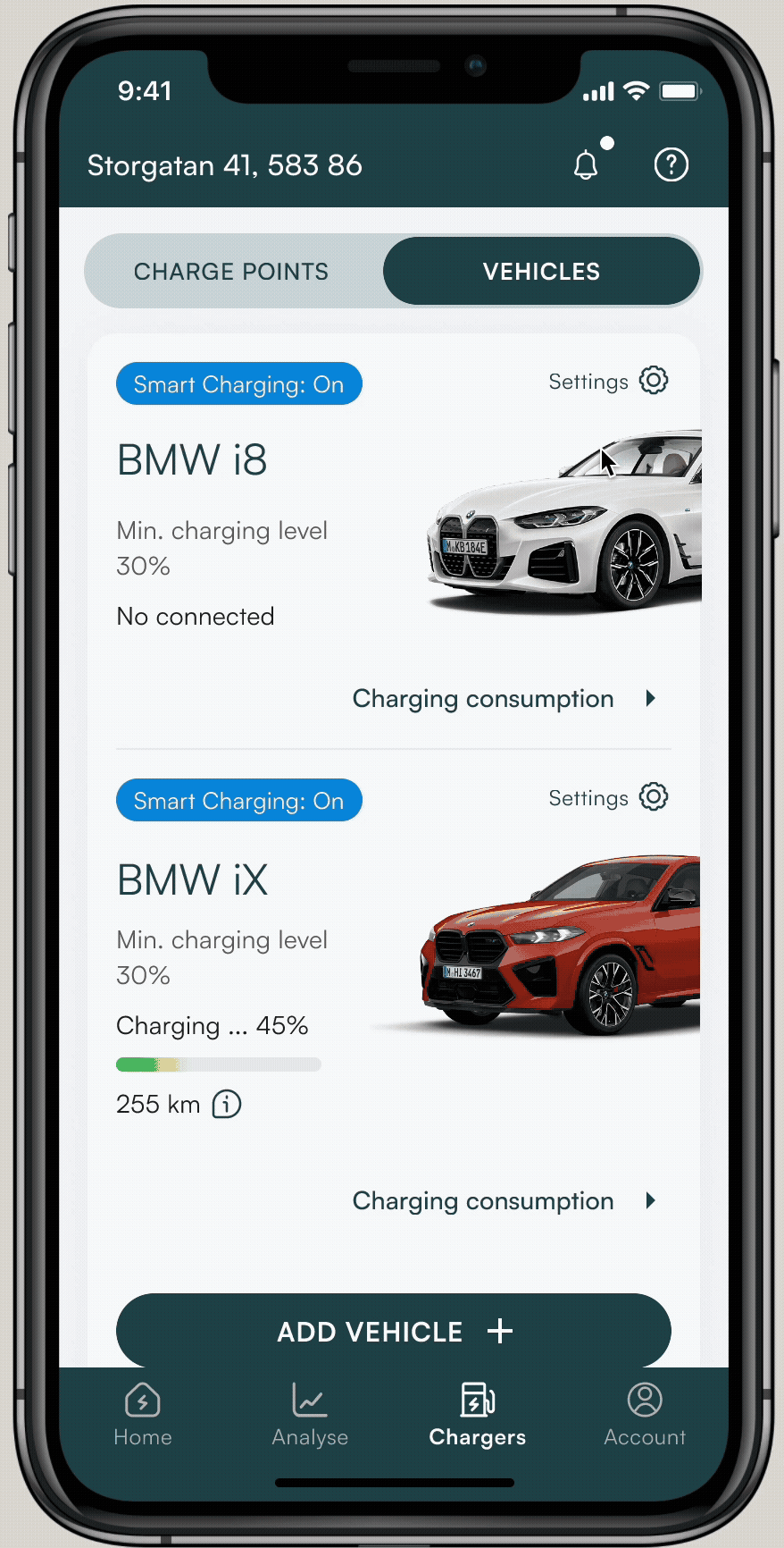
The app was designed as an all-in-one energy management app, and EV charging was a core part of that vision. The EV section gave users full visibility and control over their charging activity, including consumption tracking per vehicle, charging schedule management, and cost breakdown, allowing them to optimise their energy use across solar generation, battery storage, and vehicle charging in a single place.
Payments
Users who participated in the balancing program were eligible to receive payments based on the energy they contributed to the grid, calculated according to current energy market prices. The payments section gave users visibility into their earnings, payment history, and the relationship between their participation activity and the amounts received, closing the loop between taking action in the app and seeing the financial outcome.
Analytics & consumption
Overview · History · Hourly charts · Full-screen detail
The analytics section gave users detailed visibility into their energy consumption across multiple dimensions, daily, monthly, and historical views, broken down by source (solar, grid, battery) and by device category. The hourly consumption chart was designed with a full-screen mode for users who needed granular detail, while the overview remained scannable for everyday use. Information hierarchy was critical here: the same underlying data needed to serve both casual users checking a summary and technically engaged users analysing patterns over time.
Analyse - Overview
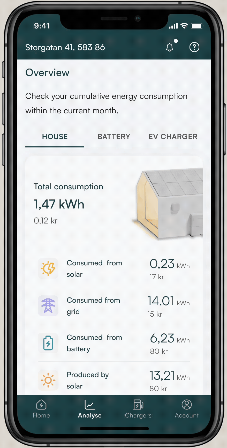
The main screen of the Analyse section provided users with a consolidated summary of their household's energy consumption across all connected sources, solar panels, battery storage, and EV charger. Having all three sources visible in a single overview gave users an immediate picture of how their system was performing and where their energy was coming from or going to at any given time.
Consumption details - History
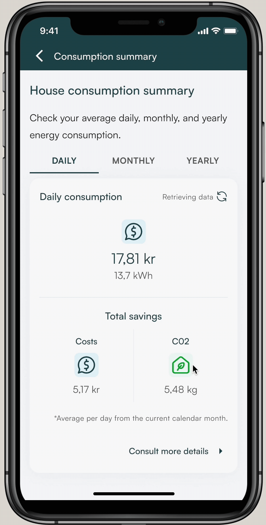
The detailed consumption view allowed users to explore granular insights into their energy usage over time, broken down by source, device category, and time period. This level of detail was designed to help users identify patterns in their consumption, understand the impact of specific behaviours, and make informed decisions about how to reduce costs or increase their solar self-consumption.


Hourly consumption - Chart full screen
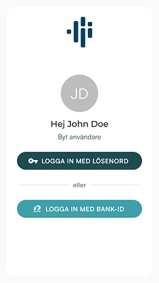
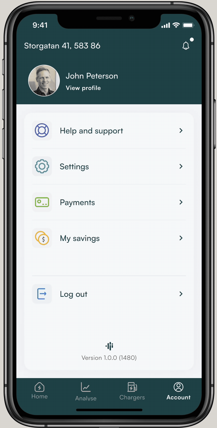
Account & password recovery
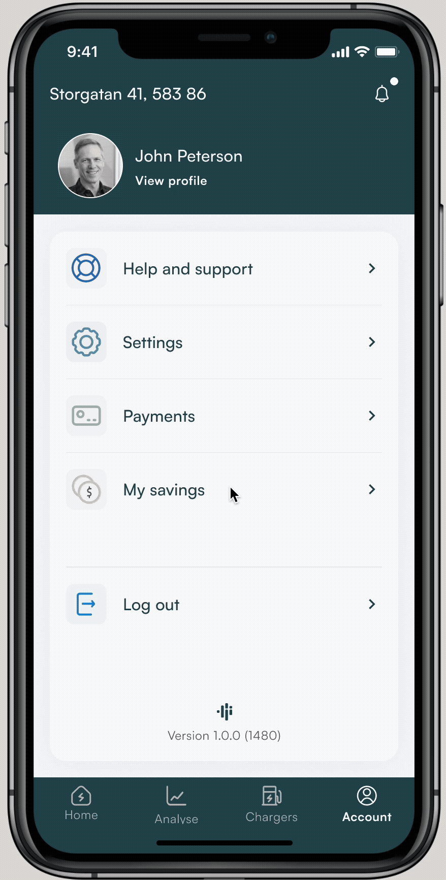
Profile · Settings · Recovery flow
The account section handled profile management, notification preferences, and installation settings, designed to be straightforward and rarely needed, reducing cognitive load on the main experience. The password recovery flow was designed with particular care for the Swedish and Norwegian market, where clarity in authentication flows directly affects trust. Both flows were tested with the QA team to ensure edge cases were handled consistently across iOS and Android.
Account
The account section was included as part of the first launch of the application, giving users access to their installation details, the ability to update their password, and the option to manage their phone number, used for notifications and service announcements. The section was designed to be straightforward and infrequently needed, keeping account management out of the way of the main app experience while remaining accessible when required.
Password recovery
The password recovery flow was designed in collaboration with the cybersecurity team, who defined both the flow structure and the password parameter requirements. This ensured that the recovery experience met the security standards required for an app handling energy system access and financial data, while remaining clear and low-friction for users who needed to reset their credentials.
Product 2: VPP Management System
Making energy market complexity operationally manageable.
A B2B desktop tool for Virtual Power Plant administration, translating Svenska kraftnät's FCR regulatory framework into an interface energy administrators could act on without external documentation.
Research & regulatory framework
FCR rules · Svenska kraftnät · Competitive analysis
FCR
Regulatory
Competitive
Before any design work began, an extensive research phase was conducted to understand the FCR energy market and its operational requirements. This included analysis of Svenska kraftnät's regulatory documentation, competitive analysis of existing VPP management tools in the Swedish and European market, and internal stakeholder sessions to map Sesol's specific operational needs and constraints. The research made clear that the primary design challenge was translating complex regulatory logic, bid windows, asset thresholds, activation frequencies, into an interface that administrators could act on without needing to reference external documentation.

An extract from the regulatory research conducted to understand the technical and compliance requirements governing battery control within Sweden's energy market. Sources included Svenska kraftnät's operational documentation, certification requirements for connected assets, and additional regulatory frameworks applicable to VPP participation. This research was foundational to the design process, understanding the rules that govern how batteries can be activated, configured, and reported on was a prerequisite for defining what the interface needed to communicate and what actions it needed to support.
Information architecture & design decisions
IA · User flows · Key decisions
The information architecture was structured around the four core operational areas an administrator needs to manage: FCR participation overview, asset management (batteries and connected devices), individual asset configuration, and performance reporting. The key design decision was to separate monitoring from configuration, giving administrators a clear operational view as the default, with configuration accessible only when a deliberate action was needed. This distinction was critical because acting on incorrect configuration in an energy market context has real financial and grid-stability implications.
Administrative panel: Sections & actions flow

An early version of the flow mapping the sections and actions within the administrative panel, developed in close collaboration with the development and data teams. The flow was defined with Svenska kraftnät's operational rules as a guiding framework, ensuring that the structure of the interface reflected the actual regulatory constraints on what administrators can configure, activate, and report on. Working cross-functionally at this stage proved critical: joint sessions with development and data surfaced technical limitations that were not visible from a design perspective alone, and identified gaps in the regulatory documentation that needed to be resolved before the interface could be finalised.

An early version of the flow for the VPP administration section within the administrative panel, developed using the same cross-functional approach as the overall panel flow. Collaboration with the development and data teams at this stage ensured that the proposed flow aligned with the technical architecture of the VPP system, particularly around how device data is ingested, processed, and made available for administrative action. Identifying these dependencies early prevented structural decisions in the design from conflicting with backend constraints later in the process.
Review session notes


Examples of notes captured during cross-functional review sessions, covering key decisions, open questions, and design constraints identified collaboratively with development, data, and stakeholders. This working approach was central to how the VPP system was defined: rather than producing designs independently and presenting them for approval, review sessions were used as a shared space to surface regulatory gaps, clarify technical feasibility, and align on feature scope. The insights documented in these sessions directly shaped the information architecture and the prioritisation of features critical to the business
Wireframes & concepts
FCR overview · Asset management · Battery config · Reporting
Concept stage
Not implemented
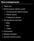
Four core screens were developed to the wireframe and concept stage, covering the primary operational flows identified through research. The FCR overview provided administrators with a real-time snapshot of participation status, active assets, and market position. Asset management allowed configuration and monitoring of all connected batteries and devices. The battery configuration screen translated FCR activation parameters into editable controls with clear constraints. The reporting view gave administrators the historical data needed to evaluate performance and adjust strategy.
These screens represent concept-stage wireframes. The project was paused before reaching visual design or development handoff due to business reprioritisation. Full Figma files available on request.
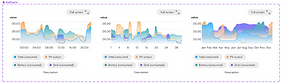
Ancillary services dashboard

Create bidding schedule

The bidding schedule view illustrated how administrators could plan and configure bidding activities. Once tasks were scheduled, defining FCR direction, set-point calculation points, and state-of-charge (SOC) targets, they could be submitted to Svenska kraftnät for review.
According to the market rules, the administrative panel also allowed future bid submissions to be scheduled in advance.
The dashboard was designed to provide the VPP administrator with a quick overview of trends and historical data, including temperature insights and ongoing operational status. It also displayed tasks currently in progress, organized along a real-time 24-hour timeline showing past, ongoing, and planned activities.
The dashboard allowed administrators to manage operational tasks (except for accepted bids), giving them control over whether the VPP should store or inject energy into the grid based on system conditions. It also provided an overview of plant statuses, enabling quick actions when necessary.
Manage Virtual Power Plant

Additionally, the administrative panel enabled the management of VPP capacities in relation to planned and submitted bids. This view provided detailed insights into capacity utilization as well as an overview of swarms and plant performance.
Edit Virtual Power Plant

As part of the overall VPP management process, administrators could also edit VPP configurations, managing both capacity and swarm composition to ensure compliance with bid parameters and VPP certification requirements.
Outcomes and lessons learned
The design phase has been successfully completed, with all designs carefully done to align with both iOS and Android guidelines for a seamless, native user experience. Throughout this process, continuous user testing and stakeholder feedback have been instrumental in refining the product.
Product reached pre-launch phase (Q2 2025) and was scheduled for customer release; development was paused two weeks before launch due to internal business reprioritisation.
Key takeaways
-
Early MVPs reduce rework: Delivering a Minimum Viable Product (MVP) as soon as possible helps validate assumptions, gather feedback, and refine features efficiently.
-
Collaboration is key: Strong communication with marketing, development, and QA teams has led to smoother development and a higher-quality product.
-
Validate technical feasibility early: Ensuring close collaboration with developers to assess feasibility before development starts helps reduce complexity and avoid roadblocks.
-
Adaptability in research: Due to project confidentiality, direct customer research was limited. Instead, leveraging competitive analysis and internal insights proved essential in defining user needs.
-
Designing for a different demographic is a game-changer: This project involved designing for users in Sweden and Norway, a market I was less familiar with, having previously focused on North American and Latin American audiences. I learned that understanding cultural nuances, user behavior, and regional preferences is crucial. This shift required adapting my design processes to ensure the app resonated with the local demographic, impacting decisions on visual design, interactions, and user flows.
With the upcoming launch, the focus remains on optimising the user experience, refining key features, and ensuring a smooth integration into the company’s energy ecosystem.


